Designing a New Homepage Experience for Zeno - An AI Evaluation Platform
Timeline
3 months, September - November 2023
Role
Product Designer, UX Researcher
Team
3 Product Designers, 2 Developers
Tools
Figma, Pen & Paper
CONTEXT
What is Zeno?
Zeno is an interactive evaluation platform that allows users to evaluate their AI & Machine Learning models. It combines a Python API with an interactive UI to enable users to discover, explore, and analyze the performance of their models across diverse use cases.
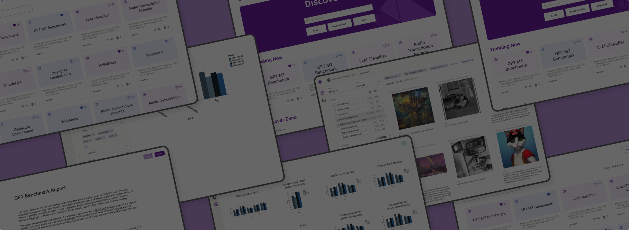
I was tasked with designing Zeno Hub - the landing page for the Zeno platform, which is where users can view all their personal projects and reports and explore public files.
Zeno Exploration View
The Problem
Zeno Hub had a poorly designed interface and low usability
Zeno had a rudimentary homepage with projects and reports. I needed to decide how to display them and consider the Hub experience for new and returning users.
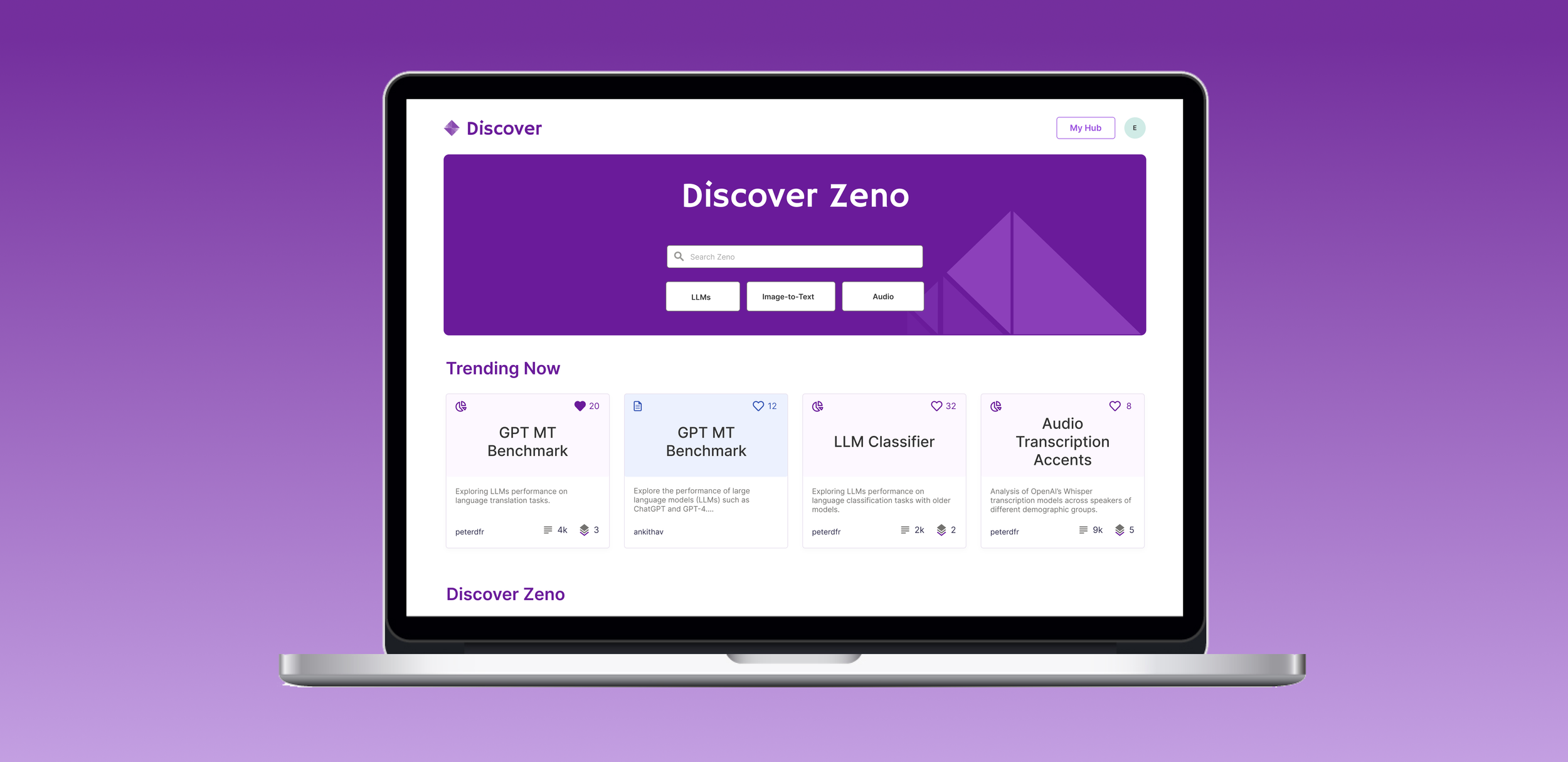
The Solution
A clean and clear interface
The new Zeno Hub home screen uses cards to display projects and reports with key information. It provides a more intuitive experience for users who can keep track of their files, and easily view public projects and reports.
Since the launch of Zeno Hub, we’ve seen a 200% increase in daily active users!
Users have created over 800 projects to evaluate more than 10,000 AI systems. These insights have been used to author over 160 reports.
DESIGN PROCESS
Audit & Market Research
I briefly audited the current design to point out opportunities for improvement and looked into other platforms like Observable and Figma Community to understand design patterns in home screens.


WIREFRAMES
The beginning of a solution
Initial sketches explored the layout of the Hub, the Explore page and the card UI for projects and reports. I decided to use cards since they help present information in a clean way while allowing for flexibility in how the information is presented (text, visuals, use of color, etc.).


First Implementation
I incorporated color to further differentiate My Hub and Explore. Through usability testing I found that current users consider the card icons to be helpful to find their files, so I decided to keep these in the new designs.


Second Implementation
After the first round of implementation I realized that the cards did not have enough text hierarchy leading to an intimidating interface for new users. I decided to separate file titles and descriptions to add more hierarchy. Additionally, users liked being able to see all their projects and reports on the same screen.


WHAT DIDN’T WORK?
Color Gradients
It was challenging to find colors that pair well with Zeno purple. The use of gradients was distracting and created a more overwhelming interface. Ultimately, using two solid colors on the hub interface seemed like a cleaner visual design choice compared to using three distinct hues or gradients.


Final Iteration

I learnt so much about AI & ML models and enjoyed working in a small fast-paced team at Zeno! I’m excited to see how the product evolves.